California: Good Luck With Your "Climate Leadership"

In the phrase of one-time U.S. Supreme Court Justice Louis Brandeis, the states are "laboratories of democracy."  With the age of Trump now upon us, and several progressive-leaning states vowing resistance to his agenda, we are about to find out a lot more about how that works.

Consider the arena of carbon emissions and climate change.  All indications are that the incoming Trump administration will be backing off from efforts at the federal level to achieve emissions reductions as a means of affecting the earth's climate.  But there's nothing to stop one or more states from trying their hand at this game.  And, over at the New York Times, they are all excited that the state of California appears ready to carry on the climate fight on its own.  The headline of the December 26 article is "California, at Forefront of Climate Fight, Won't Back Down to Trump."   

California — a state that has for 50 years been a leader in environmental advocacy — is about to step unto the breach. In a show of defiance, Gov. Jerry Brown, a Democrat, and legislative leaders said they would work directly with other nations and states to defend and strengthen what were already far and away the most aggressive policies to fight climate change in the nation. That includes a legislatively mandated target of reducing carbon emissions in California to 40 percent below 1990 levels by 2030.

Dare we be so impolite as to ask, what can they hope to achieve, and at what cost?

On the subject of "what they might achieve," the Cato Institute has put out a handy "Carbon Temperature Savings Calculator" to enable us to determine the avoided rise in world temperature resulting from any given reduction in carbon emissions.  Now, you might say, this Calculator can't be anything but hocus-pocus, because there does not exist any validated empirical relationship between CO2 emissions and world temperature.  You would be right about that.  But Cato didn't just make this thing up.  The Calculator is based on a model for the relationship between CO2 emissions and world temperature called MAGICC, which has been cooked up by a government bureaucracy called the National Center for Atmospheric Research, with funding from EPA (of course).  Here is a link to the government website describing the MAGICC model.  In other words, these are the government's worst-case numbers, created in the effort to scare the bejeezus out of us over how much temperatures will rise as a result of carbon emissions.  Surely, the same model that can tell us how much temperatures will rise as a result of increased carbon emissions can also be used to tell us how much temperature rise will be avoided from reduced carbon emissions.

To apply the Calculator, you need to select what percent of CO2 emissions you would like to eliminate, as well as your preferred "climate sensitivity" (in other words, by how many degrees will world temperatures increase for a doubling of CO2 in the atmosphere?).  For percent of CO2 emissions eliminated, you can select 20%, 40%, 60%, 80%, or 100%.  Let's go for 100% -- send them back to the stone age!  For "sensitivity," you can choose among 1.5 deg C, 3 deg C, or 4.5 deg C.  Let's go all the way to 4.5 deg C.  The Calculator will not break this down by state, but only gives an answer for the full U.S.  And the answer is, with those extreme assumptions, 0.062 deg C of temperature rise avoided by 2050, and 0.173 deg C of temperature rise avoided by 2100.

But how much can California achieve on its own?  Given that California is about a tenth of the U.S. in population and energy usage, we can get an estimate of what California alone can achieve by elimination of its carbon emissions by dividing the full-U.S. numbers by 10.  (Math geeks among the readers will recognize that this linear assumption will in fact considerably overstate the effect that California alone can have, since the relationship between atmospheric CO2 and temperature is thought to be logarithmic rather than linear.)  Anyway, divide by 10 and you find that, assuming that California eliminated all of its carbon emissions, and with "climate sensitivity" of 4.5 deg C, California will save the world from about 0.0062 deg C of temperature increase by 2050, and 0.0173 deg C by 2100.

Now suppose you think that California will never really be able to achieve more than about 60% reduction in carbon emissions, and that climate sensitivity is more like 1.5 deg C.  (I would say that 1.5 deg C is still way too high.  After all, there is no actual empirical proof that climate sensitivity to atmospheric CO2 is anything other than zero.  But whatever.)  On those assumptions you have California affecting world temperature through its climate policies by 0.0021 deg C by 2050, and 0.0045 deg C by 2100.  Whoopee!

Now let's look at the cost.

California is already a leader in the U.S. in getting a high percentage of its electricity from the big so-called "renewables," wind and solar.  According to this chart from the California Energy Commission, in 2015 California got 6% of its electricity from solar, and 8.2% from wind.  Oh, and its average electricity rate in 2015 was 15.62 cents per kwh, versus a U.S. average of 10.31 cents per kwh, according to the U.S. Energy Information Agency here.  Cause and effect?  That's hard to know.  

But we can look to places that have driven the percentage of electricity generation from wind and solar up to much higher levels.  For example, there's Germany.  Germany began its so-called Energiewende ("energy transformation") in 2010, and by 2015 had gotten the portion of its electricity generated from the big renewables up to a whopping 31%, according to a chart here from the EIA.  A chart here from Clean Energy Wire puts the average residential German electricity rate at 28.8 cents per kwh.  Cause and effect?

And at 31% of electricity production, the intermittent renewables are pushing up against the limits of what they can contribute without resorting to a series of far most costly additions to the electricity system -- additions like massive excess capacity, backup, storage and additional transmission.  Consider this piece from The Bulletin of the Atomic Scientists, "Germany's  Energiewende : the intermittency problem remains," by Christine Sturm in May 2016:

Given that Germany’s electricity grid did not collapse [as production from intermittent renewables increased to 31%], one might declare the intermittency problem as solved. Unfortunately, this ignores two essential aspects of the Energiewende that explain how Germany solved the intermittency problem until now. First, the problem of generating electricity on cloudy and windless days could only be managed because utilities were obliged to cover these intermittencies by maintaining and running fossil power plants as backup source, in an uneconomic mode. Second, Germany’s electricity generation on windy and sunny days often exceeds by far the grid’s balancing abilities, forcing the power surplus into the adjacent grids of neighboring countries, and obliging other countries to compensate for German intermittencies. These solutions are neither sustainable nor possible in a carbon-free economy. Moreover, whether bold Energiewende-like concepts will be successful or not essentially depends on our ability to really solve the intermittency problem.

So even to get to its 31%, Germany has had to rely on the indulgence of its neighbors to take power off its hands on days when too much sun and wind would otherwise overload its grid.  How do you get to 50%, or 60%, and with a reliable system that works 24/7/365?  As I detailed in this post back in August, a demonstration project by a utility in Korea attemted to get a majority of electricity production from wind, and found it needed about four times excess capacity, plus full fossil fuel backup, plus massive amounts of battery storage.  And they still only got to 42% of electricity production from wind over a full month-long period.  And the system cost about 10 times as much as a conventional system.

So, good luck California!  Unless you can come up with some kind of technological innovations in electricity delivery that no one has thought of yet, if you really want to get to 60% reductions in carbon emissions you are likely to face electricity bills at least three to five times what others in the U.S. face.  And maybe ten times!  But you can console yourselves that you have made world temperatures 0.0045 deg C cooler than they would have been by 2100.

Something tells me that in the real world California will never actually go through with this.  Or are they really that dumb?    

Venezuela: Useful Idiots Roundup

For those who enjoyed my Fidel Castro roundup from last month, I thought it might be fun to do a similar roundup of what the useful idiots have said over the years about Venezuela during the dictatorships of Chavez and Maduro.

Unless you have been living in a cave for the last couple of years, you undoubtedly already know that after almost 18 years of "Bolivarian socialism" the economic situation in Venezuela has become desperate.  For news just in the past few months, you might consider:  The New York Times from Christmas day ("No Food, No Medicine, No Respite: A Starving Boy's Death in Venezuela");  The Independent from December 16 ("We're living in the end of times: Starving Venezuelans giving away children to survive"); Legal Insurrection from November 26 ("Starving Venezuelans Flee Socialist Nightmare By Boat"); The Hill from October 24 ("My Native Country of Venezuela Is Starving").  There are plenty more such stories if you can stand it.

So, how about a few quotes from the idiots:

Linda Poon in Wired, April 25, 2016 (!) ("Venezuela's Economic Success Fueled Its Electricity Crisis"):

Earlier this April, . . . president [Maduro] called on women to stop using hairdryers, and to save them only for “special occasions.” He also asked citizens to hang their clothes instead of using dryers and to embrace the heat. . . .  The current crisis is essentially what [Professor Victor] Silverman [of Pomona College] calls a problem of the country’s own economic success. . . .  “The Venezuelan economy reduced poverty at one of the most rapid rates in the world, and certainly one of the most rapid rates in Latin America over the past 20 years,” he says. “That meant people had the money to buy refrigerators, air conditioners, and … hairdryers.”

Ben Norton in Salon, December 7, 2015 (!) ("13 years after failed U.S.-backed coup, right-wing opposition wins Venezuela election"):

For 17 years, the PSUV has enjoyed enormous popularity in Venezuela. Its economic and social programs drastically reduced poverty, created universal healthcare, and promoted widespread literacy and education. Compared to its Latin American neighbors, Venezuela has consistently led the region in reducing poverty.

Peter McLaren (of Chapman University) and Mike Cole (of University of East London) in Truth-Out.org, June 11, 2014 ("Austerity/Immiseration Capitalism: What Can We Learn From Venezuelan Socialism?"):

While democratic socialism may sound utopian in the European context, and positively unimaginable in the United States, there is [in Venezuela] a viable alternative to the neoliberal model in existence. It is incumbent on the left to think seriously about what can be learned from the Bolivarian revolution. That revolution can provoke us to imagine an alternative to capitalism, whether through forms of freely-associated producers planning and allocating the social wealth, syndicalist and Marxist forms of socialism, or self-governing popular assemblies or autonomous communities.

Mark Weisbrot in the Guardian, November 7, 2013, ("Sorry, Venezuela haters: his economy is not the Greece of Latin America"):

For more than a decade people opposed to the government of Venezuela have argued that its economy would implode. . . .  How frustrating it has been for them to witness only two recessions: one directly caused by the opposition's oil strike (December 2002-May 2003) and one brought on by the world recession (2009 and the first half of 2010). However, the government got control of the national oil company in 2003, and the whole decade's economic performance turned out quite well, with average annual growth of real income per person of 2.7% and poverty reduced by over half, and large gains for the majority in employment, access to health care, pensions and education.

David Sirota in Salon, May 6, 2013, "Hugo Chavez's Economic Miracle":

[A]ccording to data compiled by the UK Guardian, Chavez’s first decade in office saw Venezuelan GDP more than double and both infant mortality and unemployment almost halved. Then there is a remarkable graph from the World Bank that shows that under Chavez’s brand of socialism, poverty in Venezuela plummeted (the Guardian reports that its “extreme poverty” rate fell from 23.4 percent in 1999 to 8.5 percent just a decade later). . . .   Additionally, as Weisbrot points out, “college enrollment has more than doubled, millions of people have access to health care for the first time and the number of people eligible for public pensions has quadrupled.”

Richard Gott in the New Statesman, January 30, 2013 ("Hugo Chavez: Man against the world"):

[Chavez] brought hope to a continent. . . .  [H]e has not only helped to construct and project Venezuela as an interesting and important country for the first time, at ease with itself and its historical heritage, he has reimagined the continent of Latin America with a vision of what might be possible.

Sean Penn in the Huffington Post, August 5, 2011 ("A State Department That Can"):

The American people have grown accustomed to hearing the Venezuelan president referred to as a dictator, not only by media representatives but by members of the leadership in both parties. This is a defamation, not only to President Chavez, but also to the majority of Venezuelan people, poor people who have elected him president time and time again. This is not a dictator supported by the wealthy classes, but rather, a president elected by the impoverished and at the service of the Venezuelan constitution, a document not unlike our own. He is a flamboyant, passionate leader.

Bernie Sanders in Valley News (Vermont), August 5, 2011 ("Close The Gaps: Disparities That Threaten America"):

These days, the American dream is more apt to be realized in South America, in places such as Ecuador, Venezuela and Argentina, where incomes are actually more equal today than they are in the land of Horatio Alger. Who's the banana republic now?

Nobel Prize-winning economist (and economic advisor to Hillary Clinton campaign) Joseph Stiglitz, quoted in Venezuela Analysis, October 11, 2007 ("Joseph Stiglitz, in Caracas, Praises Venezuela's Economic Policies"):

Venezuela's economic growth has been very impressive in the last few years. . . .  Venezuelan President Hugo Chavez appears to have had success in bringing health and education to the people in the poor neighborhoods of Caracas, to those who previously saw few benefits of the countries oil wealth.

You could go on with this all day if you want.  The important thing to understand is that, as long as you claim to have improved "healthcare" and "education," and you utter the right platitudes about "social justice," you can put out completely fake economic statistics and these dopes will fall for it every time.  Meanwhile, on August 10, 2015 the Mail Online reported that the richest person in Venezuela was none other than Maria Gabriela Chavez, daughter of the recently-deceased dictator.  They reported her wealth as $4.2 billion, almost entirely held in foreign banks and non-Venezuelan currencies, of course.  Somehow, none of the linked articles above mentions the case of Ms. Chavez.


Can The Separation Of Powers In The Federal Government Be Righted?

Probably, somewhere in high school or even junior high school, you learned about the "separation of powers" in the U.S. Constitution.  There are legislative, executive and judicial powers, each assigned to a separate branch of the government.  There are "checks and balances" between and among the branches.  Thus, our freedoms are preserved.  Or so we are taught.

But if you study the U.S. government today, you quickly learn about vast areas of the government that have somehow broken free of the separation of powers.  I'm talking about the so-called "independent" agencies, like the FTC, FCC, SEC, CFPB, CFTC, CPSC, PCAOB and others.  These agencies are not explicitly part of any of the three branches, yet they promulgate thousands of pages of regulations (legislative power?), and then prosecute people and companies for violating the regulations (executive power?) before administrative judges (judicial power?) who are part of the agency rather than part of the court system.  Where is this provided for in the Constitution?

The answer is that all of this is entirely unconstitutional.  The Constitution provides for exclusive grants of the three types of power to the three branches of the government, and to no one outside that structure.  (Article I: "All legislative Powers" are "vested" in the "Congress"; Article II: "The executive Power" is "vested" in the "President"; and Article III: "The judicial Power" is "vested" in the federal courts.)  But the Supreme Court, in one of the most bizarre decisions in its history -- Humphrey's Executor in 1935 -- signed off on at least one aspect of the independent agency structure.  Given that little opening, the independent agencies, with the blessing of Congress, have proceeded to metastasize like a cancer ever since.

When Franklin Roosevelt was elected President, Humphrey was a Commissioner of the FTC, having been appointed for a seven-year term by prior President Hoover.  The FTC Act provided (and still provides today) that a Commissioner could be removed by the President for "inefficiency, neglect of duty, or malfeasance in office."  Roosevelt asked Humphrey to resign, but not explicitly for any of those reasons; rather, Roosevelt just wanted the agency to take a different tack than it had taken under Hoover.  Humphrey refused to resign.  By the time the case reached the Supreme Court, Humphrey had died, and the entire case was about his estate suing for pay for the period from his refusal to resign to his death.  The government's position was that since all executive power of the government was held by the President, the President could demand the resignation of anyone he wanted.  But the Supreme Court upheld Humphrey's refusal to resign -- on the ground that the FTC was not under the President's authority because it did not hold or exercise any executive power!  After describing the FTC's functions as including investigating and prosecuting violations of the FTC Act, the Court set forth this incomprehensible logic:

The Federal Trade Commission is an administrative body created by Congress to carry into effect legislative policies embodied in the statute in accordance with the legislative standard therein prescribed, and to perform other specified duties as a legislative or as a judicial aid. Such a body cannot in any proper sense be characterized as an arm or an eye of the executive. Its duties are performed without executive leave, and, in the contemplation of the statute, must be free from executive control. In administering the provisions of the statute in respect of "unfair methods of competition" -- that is to say, in filling in and administering the details embodied by that general standard -- the commission acts in part quasi-legislatively and in part quasi-judicially. In making investigations and reports thereon for the information of Congress under 6, in aid of the legislative power, it acts as a legislative agency. Under § 7, which authorizes the commission to act as a master in chancery under rules prescribed by the court, it acts as an agency of the judiciary. To the extent that it exercises any executive function -- as distinguished from executive power in the constitutional sense -- it does so in the discharge and effectuation of its quasi-legislative or quasi-judicial powers, or as an agency of the legislative or judicial departments of the government.

Got that?  If you somehow think that "carrying into effect legislative policies embodied in a statute" is the very essence of executive power, then I guess you just need to go to re-education camp.  And what about the idea that if the powers exercised by the agency are not executive, then they must be some combination of legislative and/or judicial, and therefore equally illegitimate?  The Court has the answer:  These are neither "legislative" nor "judicial" powers, because they are only "quasi-legislative" and "quasi-judicial" powers!  No problem then!  And how are we mere humans supposed to tell the difference between "legislative" and "judicial" powers on the one hand, and "quasi-legislative" and "quasi-judicial" powers on the other?  You won't find that answer here.  And yes, this is the entire basis on which the government has claimed the ability for four-fifths of a century to defeat the constitutional separation of powers, and transfer unaccountable executive, legislative and judicial powers all to the same people.

Remarkably, in the eighty-one years since this decision, Humphrey's Executor has never come up for serious reconsideration.  From time to time in the past couple of decades there has been the lonely voice of Justice Clarence Thomas pointing out the obvious illegitimacy of exercise of federal power outside of the three authorized branches, most notably in his recent concurrence in Department of Transportation v. Association of American Railroads in 2015.  But somehow, a frontal assault on the agencies has been avoided.

Which brings me to the perhaps equally bizarre decision a couple of months ago of the D.C. Circuit, per Judge Kavanaugh, in PHH Corp. v. Consumer Financial Protection Board.  The CFPB initiated a prosecution against PHH, which ended with an order from the CFPB for PHH to pay $109 million.  PHH challenged the authority of the CFPB under the constitutional structure of the government, for example in being free from control of the President by reason of the protections afforded the Director from being fired, as well as being free from Congress's power of the purse by reason of having a funding stream from the Federal Reserve.  The D.C. Circuit held the structure of the CFPB to be unconstitutional, but on the narrow ground that the CFPB has a sole Director, as opposed to the multi-commissioner structure of the other "independent" agencies like the FTC, FCC, SEC, etc.: 

The CFPB’s concentration of enormous executive power in a single, unaccountable, unchecked Director not only departs from settled historical practice, but also poses a far greater risk of arbitrary decision-making and abuse of power, and a far greater threat to individual liberty, than does a multi-member independent agency. The overarching constitutional concern with independent agencies is that the agencies are unchecked by the President, the official who is accountable to the people and who is responsible under Article II for the exercise of executive power. Recognizing the broad and unaccountable power wielded by independent agencies, Congresses and Presidents of both political parties have therefore long endeavored to keep independent agencies in check through other statutory means.  In particular, to check independent agencies, Congress has traditionally required multi-member bodies at the helm of every independent agency.

Fair enough.  But nothing in Humphrey's Executor relied upon the multi-commissioner structure of the FTC as part of the logic to save the agency.  If an agency violates the three-branch structure of the Constitution, then why isn't that the end of the matter, and of the agency?  

I suppose one way of looking at PHH is that the D.C. Circuit is bound to follow the precedents of the Supreme Court, so Kavanaugh could not challenge Humphrey's Executor.  Therefore, he came up with the most absurd possible reason for distinguishing Humphrey's Executor, thus making an obvious invitation to the Supreme Court to do the right thing when the case inevitably gets there.

So is there any chance that the basic principles of the separation of powers will get righted over the next several years?  I kind of doubt that President-elect Trump is even aware of this issue.   On the other hand, you can be sure that the current "liberal" wing of the Supreme Court is completely OK with the idea of completely autonomous and unaccountable federal agencies not subject to any sort of control or oversight.  And any nomination of Hillary Clinton to the Court would have been OK with that as well.  Trump?  He might even nominate Kavanaugh!  Or Randy Barnett!  Or Eugene Volokh!  You never know. 


Christmas Trees In New York

The famous Christmas tree in New York is of course the one at Rockefeller Center in Midtown Manhattan.  But there are some other good Christmas trees around town as well.  Here are a few located in the Downtown area (south of 14th Street).  The first one is on Broad Street, just south of Wall Street.  The building on the left with the row of Corinthian columns is the New York Stock Exchange.  Can you spot the statue of George Washington, standing on the very spot where he took the oath of office in 1789 as the first President of the United States?

Fifth Avenue comes to an end at Washington Square Park in Greenwich Village.  At that spot there is a large triumphal arch designed by the architect Stanford White and built in 1892.  Each year they put a Christmas tree under that arch.  If you view the tree from the south (as here) you can see the Empire State Building in the distance, about a mile and a half away.  It is lit up in red and green colors for the Christmas holiday.

Over in the West Village at Abingdon Square Park, we have a more modest Christmas tree in our little corner of greenery.  In this view, looking south, you can see the new One World Trade Center to the right of the tree. 


Merry Christmas to all!

How To Tell Who's Lying To You: Climate Science Edition

Scott Adams -- known, among other things, as the cartoonist behind the Dilbert series -- has an excellent blog on which he posts something thoughtful nearly every day.  His particular interest is in the arts of persuasion.  Recently he has dipped his toe into the subject of "climate science," with a focus on the apparent inability of partisans on either side of the debate ever to convince a single person to come over from the other side.  Now, suppose you come to this debate with no scientific expertise and no ax to grind for either side.  The debate has very significant public policy implications, and understanding it is important to being an informed voter.  How are you to supposed to evaluate the arguments and come to a view?  Adams comments:

My bottom-line belief about climate science is that non-scientists such as myself have no reliable way to evaluate any of this stuff. Our brains and experience are not up to the task. When I apply my tiny brain to sniffing out the truth about climate science I see rock-solid arguments on both sides of the debate.

I'm going to respectfully disagree with Adams on this one.  If you are a reasonably intelligent person, and you are willing to spend a few hours on an issue, there is a very workable method to discern which side of a debate is not playing straight with you.  This method is the same method generally used by judges and juries in deciding which side is going to win a trial.  The method is this:  look to which side has and provides the best answers to the hard questions posed by the other side.  If one side refuses to answer hard questions, or is evasive, or refuses to provide the underlying methodology by which it came up with its answers, then that side has a problem.  And rightfully so. 

I'll give just a few examples of this phenomenon relevant to the climate change issue.

(1) The Hockey Stick graph.  The so-called Hockey Stick graph first appeared in a paper by Mann, Bradley and Hughes that was published in Nature magazine in 1998.  It purported to show a reconstruction of worldwide temperatures from the year 1000 to present, in which the temperatures had remained almost completely stable for the first 900 years (the "shaft" of the Hockey Stick), and then suddenly shot up in the twentieth century in the time of human CO2 emissions (the "blade").  This reconstruction effectively repealed the prior accepted version of climate history, in which temperatures had been warmer than the present at least in the so-called Medieval Warm Period of about 1000 - 1300, and probably also in the Roman Warm Period around the year 0.  When the UN's climate-evaluation body, the IPCC, issued its next Assessment Report in 2001, the Hockey Stick graph had suddenly become the icon of the whole endeavor, appearing multiple times in the Report.  The Hockey Stick seemed like the perfect proof of the proposition that global warming must be caused by humans, because anyone could see from the graph that the warming had all occurred in the era of human use of fossil fuels.  Here is a version of the Hockey Stick graph from the IPCC Third Assessment Report:

Manns-hockey-stick.gif

Unfortunately for Mann et al. and the IPCC, numerous people -- those nefarious "skeptics" --promptly began to ask questions about the source of the information behind the "shaft" of the stick.  Thus these skeptics were questioning the ideas that temperatures had remained essentially stable for a millennium and that there had been no Medieval Warm Period.  The most famous of the skeptical researchers was a Canadian named Stephen McIntyre.  McIntyre began a blog called Climate Audit, and started writing many long posts about his efforts, all unsuccessful, to replicate the Mann et al. work.  Requests to Mann et al. for their data and methodologies were met with hostility and evasion.  Over time, McIntyre gradually established that Mann et al. had adopted a complex methodology that selectively emphasized certain temperature proxies over others in order to reverse-engineer the "shaft" of the stick to get a pre-determined desired outcome.

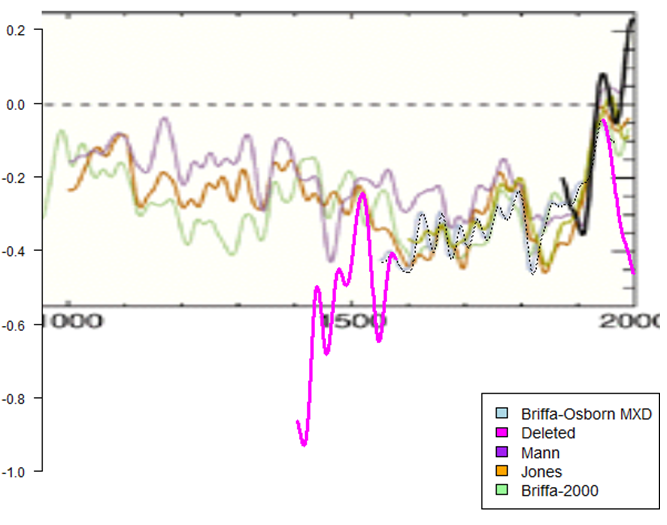
The coup de grace for the Hockey Stick graph came with the so-called Climategate emails, released in 2009.  These were emails between and among many of the main promoters of the climate scare (dubbed by McIntyre the "Hockey Team").  Included in the Climategate releases were emails relating specifically to the methodology of how the graph was created.  From the emails, skeptical researchers were then able to identify some of the precise data series that had been used by Mann et al.  Astoundingly, they discovered that the graph's creators had truncated inconvenient data in order to get the desired depiction.  A website called Just the Facts has a detailed recounting of how this was uncovered.  As a key example, consider this graph:

The bright pink represents data that was deleted from the Mann et al. reconstruction because, obviously,  it would have thrown off the nice, flat "shaft" of the stick, while also revealing that this particular "proxy" had totally failed at predicting the twentieth century rise in temperatures.  Most would call this kind of data truncation "scientific fraud."

Note that the revelations that came out of the Hockey Stick controversy do not prove that the human-caused global warming hypothesis is wrong.  However, those revelations did show beyond doubt that the leading promoters of the hypothesis had resorted to fraud in the effort to get the public to accept their position.  Once that was established, why would you believe anything else they say?

Even today, the Wikipedia write-up of the Hockey Stick controversy takes a position favorable to Mann et al.  If you are willing to devote some time to this issue, read that article next to the write-up at Just the Facts linked above.  I would call the Wikipedia article evasive in the face of highly credible allegations of fraud.  See if you agree.

(2) Adjustments to the instrumental temperature record.  World temperature records based on ground-based thermometers date back to about the late 19th century in most cases.  These records are far more accurate than what we have from earlier times (which are mostly "proxies," like tree rings and ice cores); but the ground thermometer records still have plenty of problems.  As examples, the location of a ground station could have been moved over time, sometimes multiple times in over 100 years; the physical surroundings of a station could have changed (trees could have grown up, or an adjacent parking lot could have been built); the type of instrument could have changed; and so forth.  Most would agree that some sorts of adjustments to the record, known as "homogenization," are appropriate to make the earlier data comparable to the more recent data.  However, here the adjustments are in the hands of small numbers of people who are committed to the global warming cause.  Most of the adjusters are government employees working for weather agencies like NASA and NOAA in the U.S., and comparable agencies in other countries.  

As with the Hockey Stick graph, independent researchers interested in the topic have gone to work at their own expense to try to understand the government's adjustments and evaluate if they are appropriate.  Notable among these researchers are Tony Heller at the website Real Climate Science and Paul Homewood at Not a Lot of People Know That.  What these researchers find is that, in literally every case, earlier temperatures have been adjusted downward, and to a lesser extent, later temperatures adjusted upward.  Obviously, such adjustments can create warming trends where they do not exist in the raw data, and enhance what otherwise might be small warming trends to make them look significant and even scary.  Here at Manhattan Contrarian, I have covered this issue in a now ten part series called The Greatest Scientific Fraud of All Time.  All ten articles are collected, along with others, here.

And literally every time anyone looks at raw temperature data, and compares it to current "final" version temperature data, the same phenomenon is found.  Just this week at Watts Up With That, an Australian meteorologist named Brendan Godwin reports that Australia is subject to the same pervasive corruption as other places:

The Australian Climate Observations Reference Network–Surface Air Temperature (ACORN-SAT) Technical Advisory Forum released a report in 2015 confirming that the Surface Air Temperatures were being adjusted, confirming the process is called Homogenization, confirming that other weather monitoring institutions around the world are making these same adjustments and purporting to justify why the adjustments are being made. Observing practices change, thermometers change, stations move from one location to another and new weather stations are installed. They refused to release their complex mathematical formula used to make the adjustments.

Go to the link to see how a slightly declining temperature trend at Rotherglen, Australia, has been turned into a more-than-one-degree-C-per-century increasing trend through supposed "homogenization" adjustments.  Huh?

But the most important part of this story is not the suspicious nature of the adjustments themselves, but rather the flat refusal of the adjusters to reveal the methodology by which the adjustments have been made.  Real, honest scientists would gladly provide the full, unedited computer code that made the adjustments, and would answer any questions that would help an independent researcher to replicate the results.  Yet read through posts of people reporting on the adjustments, and you will universally find that they have been rebuffed in their attempts to find out what is going on.  For example, as I reported in this post in July 2015, a heating consultant in Maine named Michael Brakey, who was just trying to get accurate temperature data to inform his business, stumbled on major recent downward adjustments of earlier temperatures in that state.  Attempting to get the details of the adjustments, the best that NOAA would give him was this vague and preposterous statement:

“…improvements in the dataset, and brings our value much more in line with what was observed at the time. The new method used stations in neighboring Canada to inform estimates for data-sparse areas within Maine (a great improvement).”  

All you need to do is read my series of posts on this topic, and/or some of the many links found in those posts, and you will know that what is going on is not remotely honest.  You don't need any specialized scientific training to figure this out.

(3) Hottest [week/month/year] ever.  Readers of my series on The Greatest Scientific Fraud of All Time are aware that our government bureaucrats at NASA and NOAA regularly put out breathless press releases announcing that some given month, or series of months, or year, was the hottest such period on record.  For example, in this post from August 2015, I reported on government press releases as to March, May and July 2015, declaring them each to be the "hottest ever" on some or another criterion.  That post also reports on how the press releases are then picked up and repeated, more or less word for word, by every news source going under the banner of "mainstream": CNN, Bloomberg, Washington Post, USA Today, BBC, AP, LA Times, CBS News, and many, many more.

But does any one of these press releases, or any one of these news sources, so much as mention that these so-called "records" are based on temperature records that have been "adjusted" to enhance warming trends?  Given how widespread is the information on unexplained warming-enhancing "adjustments," it is almost incomprehensible that not one of these news sources would even ask the question, "How much of the warming is in the raw data and how much is in the adjustments?"  But if such a thing exists, I can't find it.

I could give many more examples, but undoubtedly you are getting the picture.  A reasonably intelligent person who investigates the situation will quickly find that the promoters of the global warming scare refuse to reveal their detailed methodology, refuse to allow independent researchers to try to replicate their work, and refuse to answer any and all hard questions.  (By contrast, when, for example, skeptical scientists a few months ago released a major Research Report claiming to invalidate all the bases for the EPA's Endangerment Finding, all data and methods were released simultaneously.)  This is all you need to know to make up your mind. 

UPDATE, December 29:  Tony Heller at realclimatescience.com has a great post on December 28 demonstrating that, at least within the United States, all warming reported by our government to have occurred since the late 1800s is a result of the adjustments to data and does not exist in the raw data.  Here is Heller's key chart:

The total of the adjustments is about 1.5 deg F, just about exactly equal to the amount of the reported "warming."  Why aren't we entitled to detailed, complete code and justification for each and every "adjustment"?

Is There Any News In The New York Times That Is Not Fake?

I'm old enough to remember when the New York Times used to have long articles filled with facts and figures, data and statistics on one issue or another.  Well, that was then -- before they had to lay off half the staff.  Now they produce articles just as long, but the formula has changed.  Instead of doing difficult leg work and collecting the real facts and figures, the new formula is to utter some obviously false statement as if it were a fact, and then fill in the rest of some multi-thousand-word article with standard-issue progressive talking points all dependent on acceptance of the false fact as the starting point. 

Friday's example of the phenomenon was an endless "climate change" article which blamed the West African refugee exodus on global warming, backed up with ridiculous and obviously false statements about the African Sahel region, like "droughts [have become] more frequent and more fierce," and it has become "impossible to grow enough food" -- when everybody who follows the actual data knows that the Sahel region has become both wetter and more agriculturally productive in recent years.  

Today's Times contains multiple more examples of the same phenomenon.

Yes, there is another one of these endless "climate change" articles, again occupying the lion's share of page A1 plus a page and a half (A14 and A15) in the interior.  This time, they're trying to convince us that polar bears are "climate refugees" because they turn up at remote Alaskan towns to look for food at the local garbage dump.  What is the evidence that polar bears are "climate refugees"?  Please, don't expect any facts and figures on what is happening with temperatures or ice coverage in the Arctic; that would tax the poor reader's intelligence way too much.  Instead, we'll just make one of those broad statements of "fact" without citing any actual source or data:

The Arctic is warming twice as fast as the rest of the planet, and the ice cover is retreating at a pace that even the climate scientists who predicted the decline find startling.

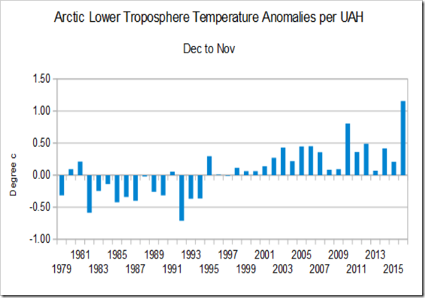
Can we actually confirm those statements from any independent source?  Over at Not A Lot of People Know That, Paul Homewood is ready with an actual collection of facts and figures to counter the "hottest Arctic ever" hype that seems to be coming out all over the place.  Here, for example, is a chart of Arctic temperature anomalies from 1979 to present per UAH:  

Looking at that chart, you might be forgiven for observing that Arctic temperatures had been dropping rather steadily since 2010, and then there was a spike just this past year associated with the 2015-16 El Nino.  (And if you follow the subject, you will know that the 2009-10 spike was also associated with a major El Nino, while the 2015-16 El Nino-related spike has been rapidly dissipating all over the world in recent months.)  So how exactly do we know that the 2015-16 spike has anything to do with human carbon emissions, or that it is anything more than a one-year El Nino-related anomaly?  Somehow, in around 4000 words, the Times does not have enough space to address that question. 

And how about the Times's statement that Arctic ice cover "has been retreating at a [startling] pace"?  Here is a chart of Arctic ice cover for the past several years from the Danish Meteorological Institute:

Sure looks like 2016 ice cover is right in the same range now (December) as in 2012 - 2015 -- and the September minimum was a lot lower in 2012.  But why should we let a few facts get in the way of a good narrative?

At Watts Up With That, Eric Worrall points out that the locals in the northern Alaska villages are dependent on tourists who come to see the polar bears.  Could there be an alternative explanation to the "climate refugee" narrative for the prevalence of the bears in the villages?:

Regarding the large numbers of bears around Kaktovik, does anyone think it possible locals whose income depends on “hundreds of tourists” visiting to see the bears might be deliberately leaving some food out?

Meanwhile, over at the editorial page, the lead editorial is given over to attacking HUD Secretary-designate Ben Carson for his allegedly "warped view of housing."  What is wrong with Carson's view?  He is skeptical of the idea that subsidized HUD housing actually helps the beneficiaries, as opposed to trapping them in poverty and dependency for life.  And in particular, Carson has expressed skepticism that HUD's latest "Affirmatively Furthering Fair Housing" scheme -- placing subsidized housing in wealthier communities and suburbs -- will accomplish anything meaningful for the intended beneficiaries.  After all, says Pravda:

Research shows that integrating poorer families into healthier, mixed-income neighborhoods has improved prospects for them and their children.

That's right, "research shows" that integrating poor families into wealthier neighborhoods improves their prospects.  Here's the "research" I recommend to the reporters and editors at Pravda.  Get outside of your damn offices, open your eyes, and walk around your home island of Manhattan.  It is the wealthiest large county in the country, and not by a little.  And it is home to proportionally more HUD-subsidized housing than anywhere, housing around 8% of the population of the island.  Many of those HUD-subsidized "projects" are in or immediately adjacent to some of the wealthiest neighborhoods in the country, including Park Avenue on the Upper East Side, the Lincoln Center area on the Upper West Side, Chelsea on the Lower West Side, and close to three miles of the waterfront along the Lower East Side.  These projects are right in the midst of the largest agglomeration of high-paying jobs in the world.  And with all that, the residents have not been helped one tiny little bit to escape from poverty, or to improve their prospects.  The "poverty rate" in these projects is said to exceed 50%, and the turnover rate is a ridiculously low 3%, meaning that essentially everyone who ever gets in gets trapped in poverty and stays for life.  Seventy years or so into a massive investment in subsidized housing as a supposed "anti-poverty" initiative, most of the formerly-poor people in Manhattan have exited poverty -- except the residents of the HUD-subsidized housing.  If HUD-subsidized housing is such a total and abject failure at getting anyone out of poverty in super-wealthy Manhattan, what exactly is the explanation for how it is ever going to work somewhere else?

At Pravda, everything they say is fake.  I guess we just have to get used to it.