At The Heartland Climate Conference: "What Is The Proof?", Earth's Energy Imbalance Edition
/In his April 9 address to the Heartland Climate Conference, physicist John Clauser devoted the first quarter of his time to the issue of extreme weather events, and the remainder to something called the Earth’s Energy Imbalance, or EEI. On April 10, I summarized the portion of the presentation relating to extreme weather events in my prior post here. Today I will discuss Clauser’s presentation on EEI.
Before hearing Clauser’s presentation, I had heard of the EEI metric, but I had not studied it in depth. Nor had I realized the extent to which the IPCC and the climate cabal have embraced this metric as providing the preferred proof of impending dangerous global warming.
The metric that has previously been most used as the supposed proof of dangerous atmospheric warming generally goes by the name Global Average Surface Temperature, or GAST. Multiple entities put out non-identical versions of GAST. The big three entities that report GAST data are NOAA and NASA in the U.S., and the Hadley Center in the UK. To calculate some version of GAST, these organizations identify a collection of surface thermometer monitoring stations around the world, and obtain the readings from each of those stations on a daily basis. Typically, they average the high and low temperatures at each station to obtain a daily average for that station, and then average all the daily averages to obtain a monthly average for each station. Then they average the monthly averages for all the stations to obtain a world-wide average for each month. The number is typically reported not as an absolute temperature, but rather as an “anomaly,” that is, a deviation from some baseline. Each of the reporting entities has a different collection of stations and a different method for calculating the baseline.
The GAST methodology is how NASA and NOAA create their monthly charts showing a sharply rising world temperature trend. This is the methodology used by Mann, et al., to create the rapidly-rising “blade” of their famous Hockey Stick graph. And it is one of the three “lines of evidence” by which EPA claimed to find CO2 and other “greenhouse gases” to be a “danger to human health and welfare” in the 2009 Endangerment Finding (recently rescinded by the Trump administration).
But do the GAST graphs really prove that some kind of “average” temperature of the earth is rising, let alone that it will continue to rise in the future? There are big problems with using GAST as a measure of global average temperature, many of which Clauser pointed out:
Temperature is what is called an “intensive” parameter, not legitimately addable, and therefore not subject to averaging.
Many of the ground thermometers in the GAST networks are near buildings, parking lots, airports and the like, that can bias their readings with “urban heat island” effects.
Many sites in the GAST networks have been abandoned over the years, leading to efforts to in-fill missing data by algorithms.
There are not nearly enough thermometers in the GAST networks to constitute a sufficient sample for statistical purposes.
Vast areas of the world have no or almost no data for large portions of the record, e.g., Southern Hemisphere oceans, and again data have been created (rather than measured) and in-filled by algorithms.
The methods for determining the baselines for the “anomalies” are poorly defined and inconsistent among reporting entities..
The deficiencies in the GAST data, and particularly the in-filling (fabrication) of missing data, were a main basis for the Petition for Reconsideration of the Endangerment Finding that I pursued with colleagues during the Trump 45 and Biden administrations.
Clauser described a process by which the IPCC has gradually moved away from relying on GAST as its proof of global warming. The change occurred between IPCC’s Fifth Assessment Report (2013) and its Sixth Assessment Report (2021). From Clauser’s slides:
The IPCC’s Fifth Assessment Report AR5 (2013) reports include a graph versus time of “temperature anomaly”. The IPCC’s Sixth Assessment Report AR6 (2021) now relies on values for the Earth’s Energy Imbalance (EEI).
Most recently, on March 23, 2026 (in case you were paying attention), UN Secretary General Antonia Guterres declared a “world climate emergency.” The alleged basis for the “emergency” was said to be the EEI, as presented in a Report by the World Meteorological Organization:
The [WMO] Report confirms that the Earth’s energy imbalance – the gap between heat absorbed and heat released – is the highest on record. In other words, our planet is trapping heat faster than it can shed it.
Granted, the EEI metric, if it can be observed with sufficient accuracy, offers tremendous advantages over GAST as an indicator of global warming (if that is in fact occurring). It avoids the problem of averaging non-averageable data; it avoids the expense of thousands of stations (and ocean-based buoys) around the world; it avoids problems of station continuity, instrument changes, and location changes. Theoretically, it could just be measured by some satellites. And, if satellite measurements can show heat building up in the atmosphere, that can provide a basis for prediction of ongoing warming.
It seemed like such a great idea. Unfortunately, Clauser shows in great detail why the whole project has been a bust. Satellites got launched at substantial expense, originally in 1985. A second generation, known as the Terra and Aqua satellites, went up in 1999 and 2002. Unfortunately, the satellites have proven to have insufficient accuracy and gaps in their measurement abilities that make it impossible to determine if there is any “energy imbalance” at all, and if so, how much.
The basic problem is that the amounts of energy coming in from the sun, and then departing back into space, are large; but the difference (if any) between the two, representing a possible build-up of energy in the atmosphere or oceans, is small. The IPCC gives a figure of the incoming radiation from the sun of 340 watts/square meter. The claimed EEI is 0.7 watts/square meter, which is only about 0.2% of the overall energy flux. This figure, appearing on Clauser’s Slide 27, is from the IPCC’s Sixth Assessment Report:
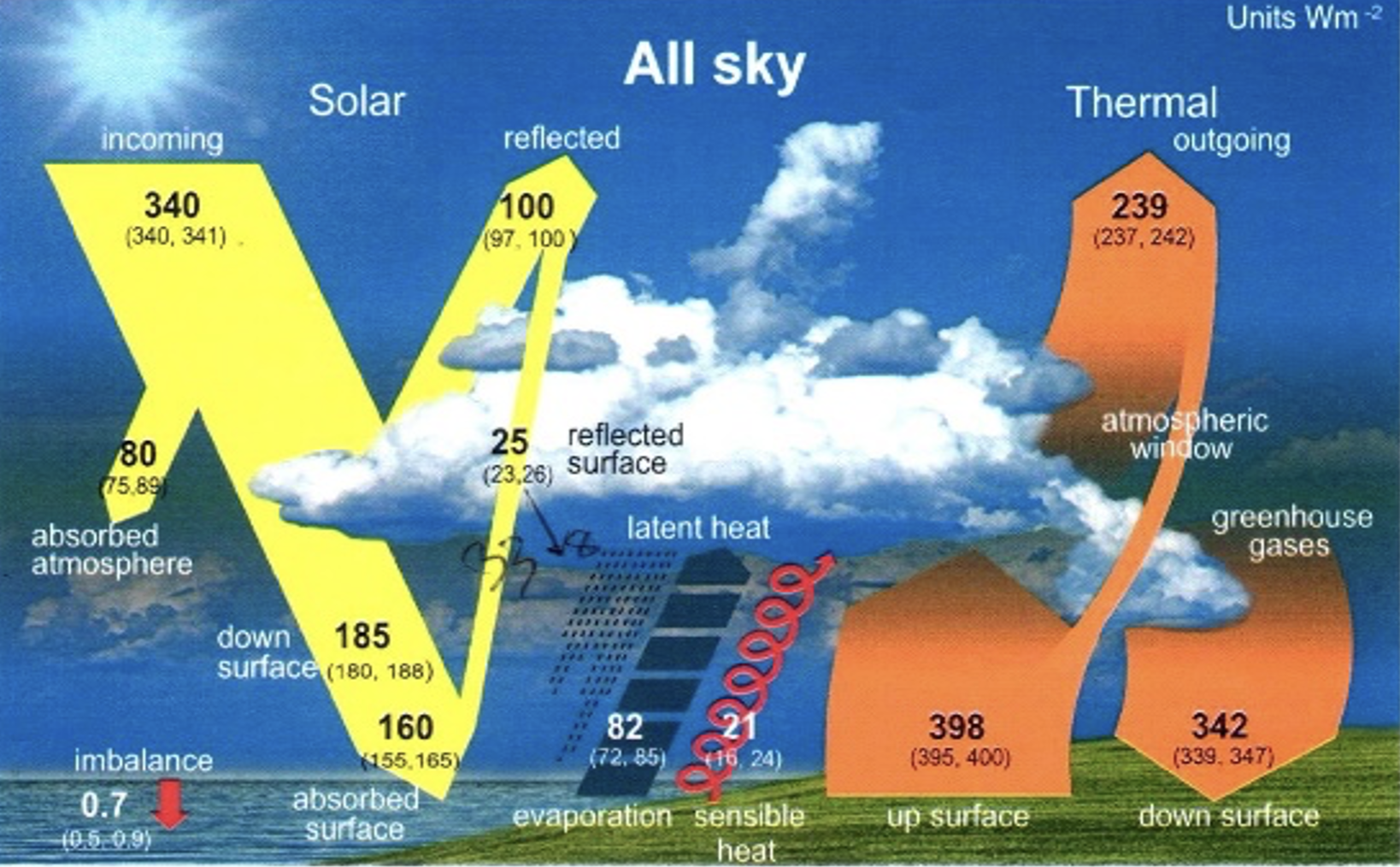
The numbers across the top show the incoming radiation from the sun of 340 w/sq.m. and outgoing of 100 w/sq.m. of short wave reflected solar radiation and 239 w/sq.m. of infrared radiation. The total of those two is 339. If you look in the lower left hand corner, you will see a figure of 0.7 w/sq.m. as the “imbalance.” That’s not exactly the difference between 340 and 339, but apparently they think it’s OK to do some random rounding of some figures but not others.
From Clauser’s Slide 34:
[P]ower-IN and power-OUT are both huge numbers, and . . . the difference between them is minuscule – about 0.2% of power-IN. That minuscule difference is the net imbalance that is sought, both experimentally and theoretically. A second difficulty occurs when power-IN and power-OUT are both hugely varying, both in time and in space, in a seemingly random and totally irreproducible fashion. Measurement and calculation errors (including round-off errors) of any of the three large component powers readily swamp the resulting error of the very small power difference. Extreme absolute measurement accuracy is thus required.
But do the satellites actually have the ability to measure the incoming and outgoing radiation at the top of the atmosphere (TOA) with sufficient accuracy to be confident that this small 0.7 w/sq.m. difference is real? Clauser has multiple quotes from the literature admitting that the measurement accuracy is not nearly adequate. Here are two quotes from Clauser Slide 33:
Loeb et al. (2012, p.111) admit, ”... A limitation of the satellite data is their inability to provide an absolute measure of the net TOA radiation imbalance to the required accuracy level. ... .” Stephens et al. (2012) admit “… The combined uncertainty on the net TOA flux determined from CERES is ± 4 W/m2 (95% confidence) due largely to instrument calibration errors. …”
If your margin of error is +/- 4 w/sq.m. and you have measured an “imbalance” of 0.7 w/sq.m., then obviously that imbalance is not significantly different from zero. Honest scientists would admit that. Unfortunately, that is not the way of climate “science.”
Clauser’s slides go into great detail on the nature of the problem. Apparently, the portion of the outgoing radiation that constitutes reflected solar radiation gets widely scattered and comes from many random directions; and the satellite instrumentation is not sufficient to capture all of it. From Clauser Slide 37:
The field-of-view [of the satellite instruments] is not at all panoramic. As a result, scattered and/or reflected [outgoing] energy that arrived from angular directions from above and below the narrow angular acceptance ribbon [is] missed. . . . The result was a too-low reported [figure for outgoing reflected solar energy], and a corresponding very-much too-high reported EEI value (6.5 W/m2).
So the actual measured EEI from the satellites was 6.5 w/sq.m., but everyone recognized that that figure was impossible and would imply much more warming than observed. How to deal with the problem? Clauser quotes a 2011 paper from the famous James Hansen of NASA:
Because this result is implausible, instrumentation calibration factors were introduced to reduce the imbalance to the imbalance suggested by climate models, 0.85 W/m2 (Loeb et al. 2009). …
When the data are clearly wrong, you just use your favorite model to modify the data until they fit your preferred theory. And with that I’m only up to Slide 39 of Clauser’s 124 slides.
The story goes on and on from there. The climate “science” community was not willing to admit that they had no means to measure EEI to prove a build up of heat in the atmosphere and oceans. Hansen and others proposed using separately-measured changes in Ocean Heat Content (OHC) to fill the gaps in the satellite data, and extensive efforts have been made to do that. But the OHC metrics are filled with their own measurement problems, many of them comparable to the problems of measuring average atmospheric temperature via GAST: the measurement is done by buoys in the ocean, rather than satellites at TOA; there are not nearly enough buoys; they do not measure heat at TOA, and thus are not comparable to the satellite energy flux measurements; the buoys sink down and rise back up, but their location is only known when they surface; the process of converting temperature measurements to heat content is dubious; there is no coverage at all of the polar regions; and so on and on.
Clauser goes into great detail about how some combination of badly flawed satellite data and badly flawed OHC data get reverse-engineered to back into a pre-determined figure of about 0.7 or 0.8 w/sq.m. as the EEI. He includes several accusations of scientific misconduct, and uses the word “fraud” liberally.
But the gist is, the accuracy of the measurements is not sufficient to claim an EEI that is meaningfully different from zero. With regard to EEI, the answer to the question “What Is The Proof?” is that there is no proof.