The Real Data On Energy Usage
/Undoubtedly you read at least some organs of the mainstream media. Perhaps your go-to source is the New York Times, or maybe the Washington Post, or Bloomberg News, or The Economist, or maybe Reuters. And therefore you have the strong impression that the world is well on its way to a huge energy transition, away from the dirty fossil fuels of the past, and toward the low carbon and renewable energy of the future. Or maybe you steer clear of all of those propagandists, but you still have the same impression. Perhaps you are getting this impression from the politicians running places like New York, or California, or Germany, or Denmark, or South Australia, or Spain, or any of many other holier-than-thou jurisdictions that have announced the imminent end of their fossil fuel use. Anyway, with so many people so loudly proclaiming the approaching end of fossil fuels, surely by now fossil fuel use must have begun its rapid drop toward oblivion.
But where can you get actual information on world energy consumption of each type, and of how it is changing over time? One quite comprehensive source is the Statistical Review of World Energy, put out each year by the BP oil company. The 2019 version, covering statistics through 2018, just came out on June 11. It was covered at Watts Up With That by Larry Hamlin on July 23.
The following chart, covering 2018 world energy consumption by fuel type, really tells you all you need to know:

In simple terms, world consumption of all the fossil fuel types continues to increase, and at fairly rapid rates. There was a notable pick-up in the rates of increase from 2017 to 2018. The “renewables,” like wind and solar — represented by that tiny red-orange band in the middle — have increased somewhat from a tiny base, but remain a barely-perceptible portion of the overall total.
Much of the interesting information in the Review appears in spreadsheets rather than graphs, so to get the most out of the report you need to spend some time with pages full of numbers. Hamlin has done some of that work for us, and comes up with some interesting statistics derived from BP’s spreadsheets. Examples:
The results for the last decade show that global energy use grew by 18.5% during the last decade with 98.5% of that energy growth accounted for by the developing nations.
The developing nations represented about 51% of global energy use in 2008 and ended the decade accounting for over 59% of global energy use.
Energy use growth by the developing nations during the last decade occurred at a rate 5.5 times greater than the flat growth rate that occurred in the developed nations.
Almost all of those energy consumption increases come from fossil fuels, of course.
In the graph category, this next one nicely illustrates the total futility of the U.S. and Europe trying to “save the planet” by reducing coal consumption:
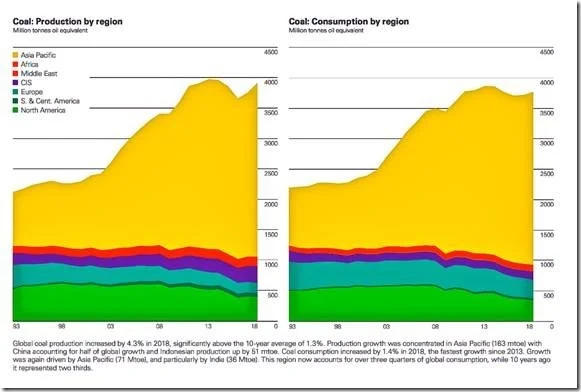
The “Asia Pacific” category in that chart includes not just China and India, but also places like Indonesia, Bangladesh, Pakistan, and Vietnam. Clearly, the increases in their coal consumption are swamping — and will continue to swamp — any modest reductions that Western nations can achieve by hobbling their economies.
A spreadsheet of carbon dioxide emissions by country and region appears at page 55 of the BP Review. Overall, world emissions were up 2% in 2018 over 2017, and up close to 12% since 2008. But those aggregate numbers hide interesting differences by country. U.S. and European emissions were both down since 2008, but in 2018 U.S. emissions increased 2.6% (with the booming economy) while European emissions continued their slow decline. China’s CO2 emissions were up 2.2% in 2018 (and up over 25% since 2008). The 2.2% increase for 2018 may not sound like all that much, but it represented an increase of about 200 million tons of CO2, an amount far exceeding the reduction of about 69 million tons of CO2 emissions achieved by Europe in that year. Meanwhile, places like India (7.0%), Indonesia (5.2%), Bangladesh (9.3%) and Vietnam (14.8%) saw their emissions soar in 2018. India’s 7% increase also represented a multiple of Europe’s decrease (about double) in terms of tons of CO2. Only one country achieved a double-digit CO2 emissions reduction for 2018. Yes, it is Venezuela, at -13.2%. Green New Deal anyone?
In short, the few rich guys who are knocking themselves out over CO2 guilt are achieving totally insignificant reductions in emissions, while those reductions are getting totally swamped by rapidly increasing emissions from the developing world.
The BP guys who put out the report are overcome with angst over what their statistics are showing. There’s this from a guy named Spencer Dale, the “group chief economist” and apparently the man in charge of compiling the Review:
[W]hen our successors look back at Statistical Reviews from around this period, they will observe a world in which there was growing societal awareness and demands for urgent action on climate change, but where the actual energy data continued to move stubbornly in the wrong direction. A growing mismatch between hopes and reality. In that context, I fear – or perhaps hope – that 2018 will represent the year in which this mismatch peaked.
Don’t they realize that they are in the oil and gas business? Anyway, I have some news for Mr. Dale: There is zero chance that any of those third world countries will stop their emissions increases until they have achieved the same levels of per capita energy consumption that we have here in the U.S. and in Europe. I say, get over your angst, relax and enjoy it.